BC Government Service Design
Innovating touch points in the transit service in Vancouver to ensure a seamless integration into the community for deaf and hard of hearing newcomers.

OVERVIEW:
My peer, Abigail and I, collaborated on this service design project on and edge case user to improve the transit service for new comers who are deaf and hard of hearing. Designers from BC Government were our external partners who provided the design brief of improving multi-language services for newcomers in Canada. We developed multiple improved touch points for newcomers landing in the international airport, taking the bus in Vancouver and using the transit app, specifically focusing on newcomers who are deaf and hard of hearing. Since this was an open brief, we had few constraints on feasibility and budget hence took a suggestive speculative design for some of our final outcomes.
ROLE:
UX Researcher, UX/UI Designer, Project coordinator
TIMELINE:
Feb – Apr 2023
SKILLS:
User research, connecting with stakeholders, wireframes, identifying areas of opportunities from user journey mapping


CHALLENGE AREA
Improving multi-language government services for newcomers in Canada so that they can seamlessly integrate into our community
The design brief that we were presented with from our external partners BC Government, was to focus on improving multi-language government services for newcomers in Canada. We needed to ensure that they are able to easily use government services to prevent any opportunities being held from them.
IMPORTANCE OF THIS PROBLEM
41.8% of the population in BC are foreign-born immigrants and improving government language services would highly improve their integration within the BC community
Improving the government multi-language service for newcomers would highly improve their integration within the BC community. There were about 83,000 newcomers from 2021 - 2022 and according to the 2021 Census, 1,089,180 people (41.8% of the population) were foreign-born immigrants. With a large portion of the population being newcomers, integration into the BC community is essential and necessary. This can also reduce social isolation and improve employment opportunities.
KICK - OFF MEETING INSIGHTS
Starting off with a HMW brainstorming session to the get our brain gears working
We started off with an amazing brainstorming session to get our gears working. We focused on generating and thinking of different 'HOW MIGHT WEs' under 5 different categories: What, When, Who, Where, How.


KEY QUESTIONS FROM THIS SESSION
1.
How might we support the work of community organisations and/or build a 2-way partnership?
3.
How might we ensure that newcomers feel safe and secure and remove social isolation?
2.
How might we gather credible and resourceful insights from diverse users?
DESIGNING FOR AN EDGE CASE USER
With many HMW questions articulated, to begin searching for answers by exploring the strategies adopted by other governments/organizations/companies?
Whilst trying to find some answers online, we came across multiple invaluable insights from TED talk videos and articles. Some of the key insights were:
90% of languages have very little resources for them. So some are resource rich- and some are resource poor .
"In today's day and age, there is no equity without accessibility" - Karyn Twaronite, EY Global Vice Chair - Diversity, Equity and Inclusiveness.


Inspired by the research insights of focusing on accessibility and resource-poor languages, we decided to narrow down our users who use ASL (american sign language) to communicate. Navigating a new city is vital to acclimatization and therefore we wanted to focus on transit systems, to help newcomers better love and integrate themselves within the commutnity.
RESEARCHING AND CONNECTING WITH EXPERIENCED INDIVIDUALS
Connecting with The Wavefront Centre for Communication Accessibility to learn about our deaf and/or hard of hearing users
We needed to reach out to the right people, bring in the support form the established communities to support us on this project. We connected with the Wavefront Centre who were skilled in proving for the deaf and/or hard of hearing community. We interviewed the director The Wavefront Centre, Rytch, who provided many key insights from our conversation.


🔍
Users find it difficult during times of emergencies as communication is not easy to understand - like on snow days.
Rytch stated that due to the lack of diverse communication during times of emergencies, people who re daf and/or hard of hearing find it difficult to know what to do during these emergencies.
🌎
Important announcements are often missed. Have to rely on other people or talking to the Transit officers who also can't communicate easily.
Announcements can ofen be missed when there is a delay/ change in schedule. These particular users find it extra difficult to try and communicate with other people on what to do.
PERSONAL DESIGN GOALS
Whilst undergoing this project, we set aside some of our own personal goals as we were focusing on an edge case user.
1.
Getting the right information
We wanted to ensure that we were not going to simply use YouTube videos or random apps to translate text into ASL for our final project. Having the right translation is key in order to respect the language as well as communicate our idea clearly.
2.
Making it universal
We wanted to ensure that we were not going to simply use YouTube videos or random apps to translate text into ASL for our final project. Having the right translation is key in order to respect the language as well as communicate our idea clearly.
3.
Improving visual design
Designing for deaf and hard-of-hearing people results in visual and graphic heavy work as they rely on their visual senses for most information. Therefore, we wanted to also focus on the feel of the visual design that also encompasses the brand identity of the BC Government.
ASSESSING CURRENT USER JOURNEY
With our insights from the chat with Rytch, we mapped out the journey for a deaf and/or hard of hearing user who tries to meet their friend outside to figure out areas of opportunities.
After meeting with Rytch from The Wavfront Centre for Communication Accessibility, we got many insights into how a deaf and/or hard of hearing user faces many issues whilst taking transit. With those insights, we mapped out a user journey map to identify more pain points and find areas of opportunties. Some of the key pain points we discovered were:
For newcomers, using the transit app may feel new. For example from personal experiences, we do not use apps in Chennai to take buses. So icons and symbols may loose meaning.
Not knowing what to do during times of emergencies.
How can we reduce reliance on mobile apps and support users to take in their new environment more.
Informing newcomers of Canadian culture. For example, saying thank you when exiting a bus.
Areas we could focus on:
1.
Improving compass card vending machine service
2.
Understanding the app and its system
3.
Lack of access to bus screens on stops
4.
Understanding of Canadian culture when using transit system
5.
Communicating with transit agents in times of help

INITIAL IDEA
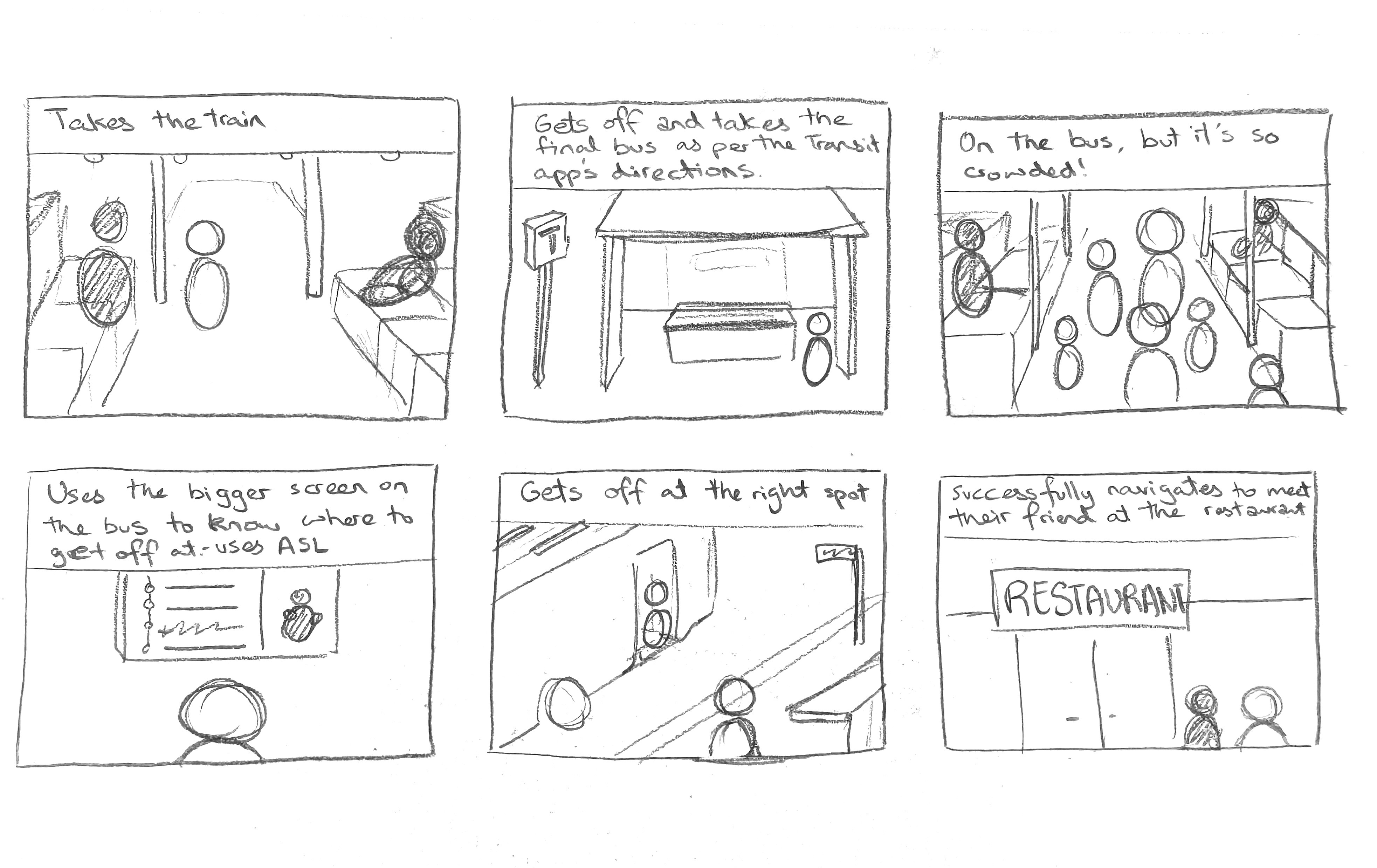
Using the areas of opportunities from the journey map to storyboard and brainstorm design interventions.
From the journey map, we brainstormed some ideas to tackle the pain points. I sketched out a storyboard to map out what the story will feel and look like for the user. The elements in the sotryboard are:
A workshop for transit agents to understand how to better communicate with individuals with accessibility requirements - this will translate into an informative booklet
Smart bus screens - will visually help the user and provide more information during emergencies
Onboarding for the transit app with ASL - this might be a very personalized feature as some countries have their own sign language so we could incorporate that as a new feature. This would speak to the users in the language they use to communicate with.
Compass card video chat - video chat to support newcomer users to buy a new compass card

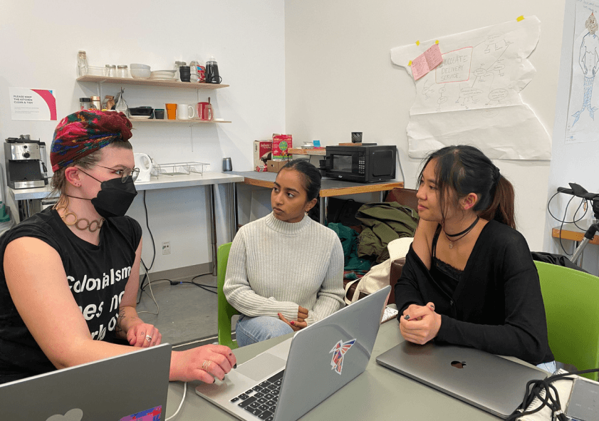
FEEDBACK FROM INDUSTRY DESIGNERS
Articulating our initial concept and receiving critical feedback to narrow down our solutions
During this guest design critique, we presented our idea to 4 designers. Each designers gave us valuable feedback and some of the key insights from this were:
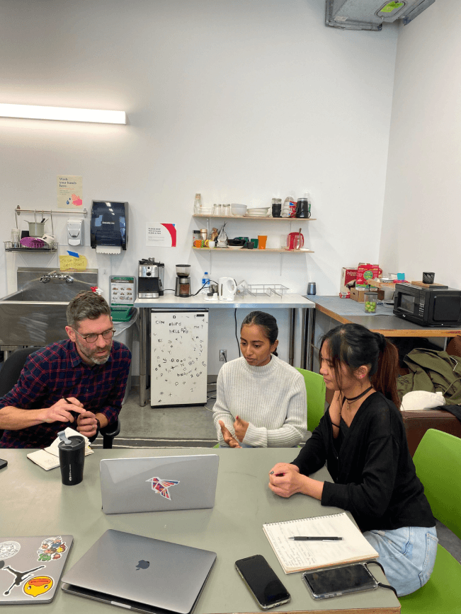
Gordon - Consider the necessity of it as well. How many people in Canada identify as deaf and hard of hearing?
Lemon - Be considerate towards your language choice and how you talk about your work.

Michelle - Try and get the right information and think about how you would conduct it.

Joanne - Consider the placement of the bus screens. Where would it go, how many etc.
IMPROVING OUR DESIGNS FROM GUEST FEEDBACk
From the guest feedback, we decided to prioritize 3 touchpoints and consider the placement of these designs in the current system
We decided to prioritize and develop the three touchpoints we had which were the bus screens with an emergency situation, creating an onboarding experience in the Transit App, and a workshop guidebook for STAs/ Operators of BC Transit.

ESTABLISHING THE FINAL TOUCHPOINTS
Designing the service blueprint to highlight the interaction and see how our designs fit into the flow
Service blueprint 1 - presents the journey and the service provided to a deaf and hard-of-hearing individual trying to meet friends at Stanley Park.

Service blueprint 2 - presents the journey and the service provided to Transit agents/ STAs/ Operators where they participate in the workshop and then support travellers in Transit.

PIVOTING AGAIN TO BASED ON USER FEEDBACK
Feedback pointed out users would not even want to interact with the officers for help, so we decided to pivot into focusing on highlighting Canadian culture
Due to the fact that, after some research and talks with other people, a Transit Agent workshop may not be the best solution to providing support. Most people who identify as deaf and hard-of-hearing may feel too shy to ask for help or think that they would not be understood properly.
[include a phot of you talking to users
"
Standing in line at the bus stops
"
"
Saying "Thank you" to the Operators
"
"
Blinking lights means "Go"
"
STYLE GUIDE
Creating our style guide and mood board highlighted our visual direction for our final outcomes
Due to the fact that, after some research and talks with other people, a Transit Agent workshop may not be the best solution to providing support. Most people who identify as deaf and hard-of-hearing may feel too shy to ask for help or think that they would not be understood properly.

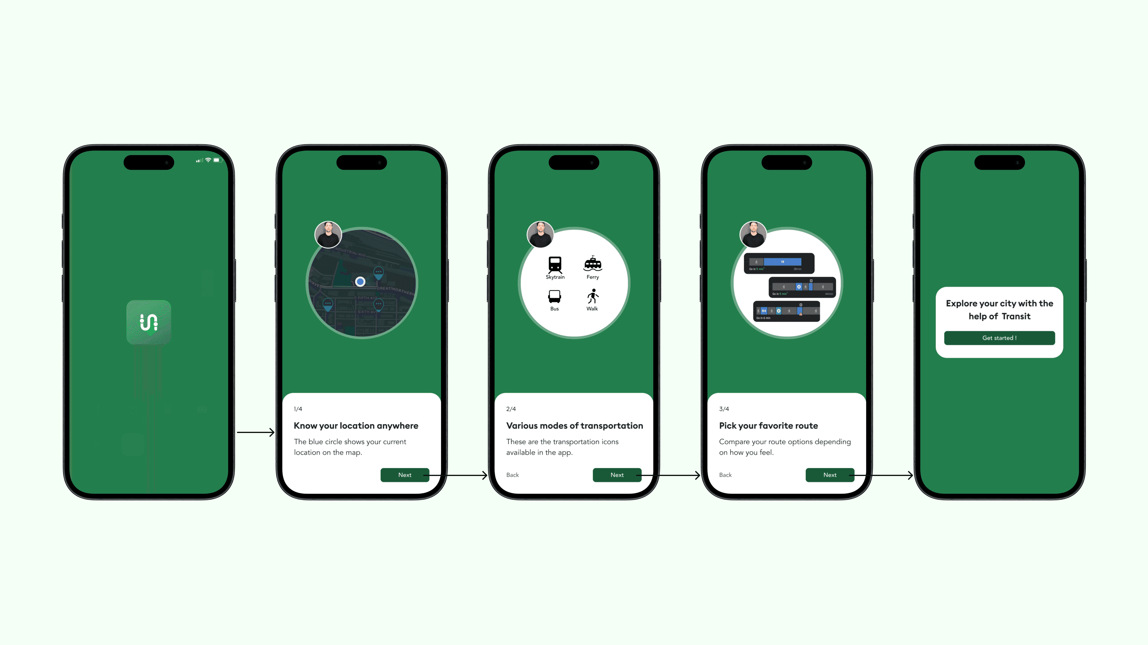
FINAL DESIGNS
Receiving the interpreted ASL for our text from the Wavefront Centre, we designed our final touchpoints
1.
Introduction welcome video at the airport
Rytch stated that due to the lack of diverse communication during times of emergencies, people who re daf and/or hard of hearing find it difficult to know what to do during these emergencies.
2.
Onboarding using the transit app
Rytch stated that due to the lack of diverse communication during times of emergencies, people who re daf and/or hard of hearing find it difficult to know what to do during these emergencies.
3.
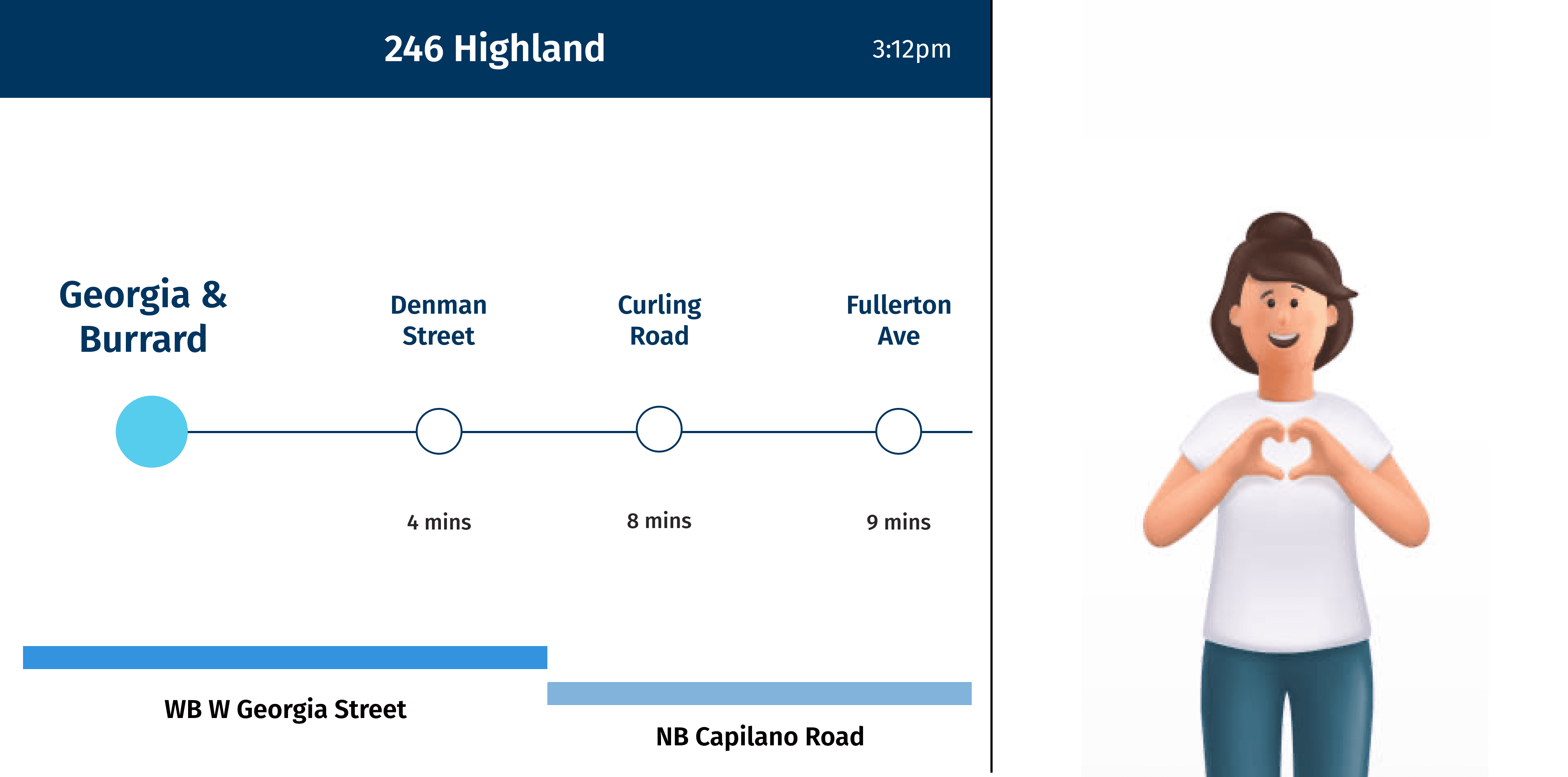
Improved bus screens with ASL interpretation
Rytch stated that due to the lack of diverse communication during times of emergencies, people who re daf and/or hard of hearing find it difficult to know what to do during these emergencies.

MEASURING METRICS
How might we measure the success of this design?
1.
Measure user loyalty/ retention
One way to check if users enjoy the new design solutions is to measure the retention from a specific period of time.
2.
User demographic survey
Another way to specifically check retention for deaf and/or hard of hearing users can be assessing the demographics from a particular period of time through surveys.
KEY LEARNINGS
Learning to collaborate with our strentghs and adapting to user feedback constistantly
Playing to our strengths and contirbuting as a team
As a team, I think we worked very well together, making sure we listened to each other's ideas and feedback, communicating, and being open-minded. Collaboratively, we used our specific design strengths such as Abigail's prototyping, filming and videography skills and my research, prototyping, visual design and animation skills to create our final video deliverable.
Pivoting is ok!
I think as designers we can often become too passionate and fixed on our first idea. Through these 3 months, we changed our methods and ideas about 3 times in order to achieve our final solution through user feedback. I learned how to be adaptive to these changes and trying to quickly think on my feet.
Other projects

Village points
Designing a points system in the Minivillage platform, increase user engagement and 86% more users feeling more active.

Nourish
Mobile application that connects international students with their families through food to nudge students to eat better food and stay healthy throughout their years.

Thank you for stopping by!
If you like what you see, let's connect and create something memorable.
© 2024 Neha Adinamozhi. All Rights Reserved.
Made with love and green tea :)
